
Commands
In this article, we will review the installation process for Eclipse IDE on CentOS8. The same procedure can apply to RHEL8 as they are similar operating


Learn how to build a responsive React dashboard with Tailwind CSS on RHEL 9 or CentOS Stream 9. Includes CLI commands, deployment tips, and full code examples.
Deploying modern frontend applications in enterprise environments like RHEL 9 or CentOS Stream 9 comes with its own challenges, from package management to security and compatibility. In this tutorial, you’ll learn how to build a responsive dashboard using React and Tailwind CSS, all configured and built on RHEL 9 or CentOS 9 systems.
This guide is perfect for developers or DevOps engineers working in Red Hat environments who want to deploy frontend dashboards within enterprise-grade infrastructure.
Ensure your system is up-to-date and ready for development.
✅ System Requirements |
| Component | Requirement |
|---|---|
| OS | RHEL 9 or CentOS Stream 9 |
| Node.js | Version 18.x or 20.x recommended |
| Package Manager | dnf for system packages, npm or yarn for Node |
| Compiler Tools | gcc, make, g++ (for native deps) |
sudo dnf update -y && sudo reboot
sudo dnf groupinstall "Development Tools" -y
sudo dnf install -y gcc-c++ make git curl pcre pcre-devel python3-pip autoconf automake libtool && sudo dnf clean all && sudo reboot
Official Node.js versions are available via the NodeSource repo.
					curl -fsSL https://rpm.nodesource.com/setup_20.x | sudo bash -
sudo dnf install -y nodejs
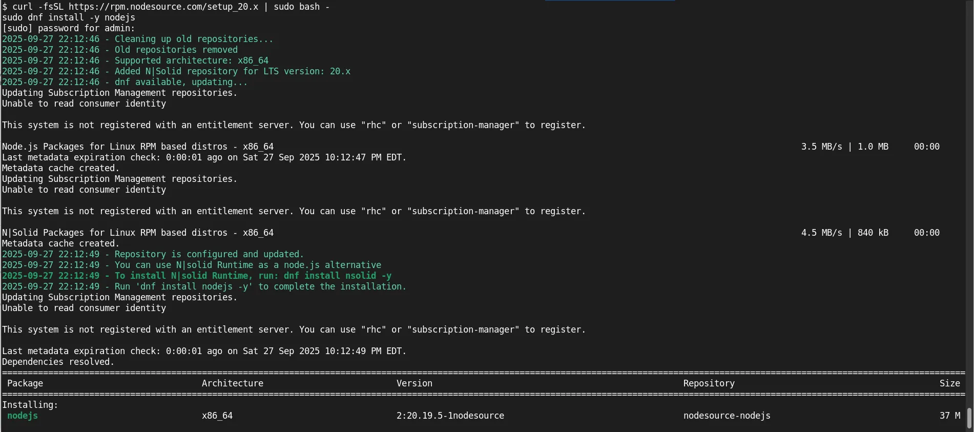
Photo by admingeek from Infotechys
Verify installation:
node -v && npm -v
					v20.19.5
10.8.2
Use Vite for fast React setup. It’s faster and more modern than Create React App.
npm create vite@latest responsive-dashboard -- --template react
Select defaults for ‘rolldown-vite (Experimental)’ and ‘Install with npm and start now’. Then, hit CTRL+C key to escape (output below) after the installation completes:
					...
  VITE v7.1.7  ready in 382 ms

  ➜  Local:   http://localhost:5173/
  ➜  Network: use --host to expose
  ➜  press h + enter to show help
cd responsive-dashboard
Ensure port 5173 is open for traffic over the network:
sudo firewall-cmd --permanent --add-port=5173/tcp && sudo firewall-cmd --reload
To start the development server:
npm run dev -- --host
					> responsive-dashboard@0.0.0 dev
> vite --host

10:32:31 PM [vite] (client) Re-optimizing dependencies because lockfile has changed

  VITE v7.1.7  ready in 441 ms

  ➜  Local:   http://localhost:5173/
  ➜  Network: http://192.168.1.213:5173/
  ➜  press h + enter to show help
💡Use |

Photo by admingeek from Infotechys
Tailwind CSS integrates seamlessly with Vite.
▶️ Install Tailwind and dependencies |
npm install -D tailwindcss@3.4.17 postcss autoprefixer
npx tailwindcss init -p
					Created Tailwind CSS config file: tailwind.config.js
Created PostCSS config file: postcss.config.js
▶️ Configure Tailwind |
Edit tailwind.config.js:
					/** @type {import('tailwindcss').Config} */
module.exports = {
  content: [
    "./index.html",
    "./src/**/*.{js,ts,jsx,tsx}",
  ],
  theme: {
    extend: {},
  },
  plugins: [],
}
▶️ Add Tailwind to CSS entry point |
Update src/index.css:
					@tailwind base;
@tailwind components;
@tailwind utilities;
We’ll create a sidebar, header, and a main content area using React components.
▶️ File Structure |
					src/
├── components/
│   ├── Sidebar.jsx
│   ├── Header.jsx
│   └── StatCard.jsx
├── App.jsx
└── index.css
🖥️ Sidebar Component |
First, create the components directory (if it doesn’t exist):
mkdir -p ~/responsive-dashboard/src/components
Then, create a Sidebar.jsx file under the components directory:
vim ~/responsive-dashboard/src/components/Sidebar.jsx
Copy and paste the following content into the file:
					// src/components/Sidebar.jsx
const Sidebar = () => (
  <aside className="bg-gray-800 text-white w-64 h-screen fixed hidden md:block">
    <div className="p-4 text-xl font-bold">Admin Panel</div>
    <nav className="mt-4 flex flex-col gap-2 px-4">
      <a href="#" className="hover:bg-gray-700 px-2 py-2 rounded">Dashboard</a>
      <a href="#" className="hover:bg-gray-700 px-2 py-2 rounded">Reports</a>
      <a href="#" className="hover:bg-gray-700 px-2 py-2 rounded">Settings</a>
    </nav>
  </aside>
);

export default Sidebar;
🔄 Rinse and repeat for the following component files. |
🖥️ Header Component |
					// src/components/Header.jsx
const Header = () => (
  <header className="bg-white shadow p-4 md:ml-64 flex justify-between items-center">
    <h1 className="text-xl font-semibold">Responsive Dashboard</h1>
    <button className="bg-blue-600 text-white px-4 py-2 rounded">Logout</button>
  </header>
);

export default Header;
🖥️ Stat Card Component |
					// src/components/StatCard.jsx
const StatCard = ({ title, value }) => (
  <div className="bg-white p-6 rounded shadow text-center">
    <div className="text-gray-600 text-sm">{title}</div>
    <div className="text-2xl font-bold">{value}</div>
  </div>
);

export default StatCard;
🖥️ App Component with Layout |
Copy and paste the following content into the App.jsx file under the src directory (vim ~/responsive-dashboard/src/App.jsx):
					// src/App.jsx
import Sidebar from './components/Sidebar';
import Header from './components/Header';
import StatCard from './components/StatCard';

function App() {
  return (
    <div className="flex">
      <Sidebar />
      <div className="flex-1 md:ml-64 bg-gray-100 min-h-screen">
        <Header />
        <main className="p-4">
          <div className="grid grid-cols-1 md:grid-cols-2 xl:grid-cols-4 gap-4">
            <StatCard title="Users" value="1,024" />
            <StatCard title="Revenue" value="$18,340" />
            <StatCard title="Orders" value="582" />
            <StatCard title="Errors" value="3" />
          </div>
        </main>
      </div>
    </div>
  );
}

export default App;
Again, start the development server:
npm run dev -- --host
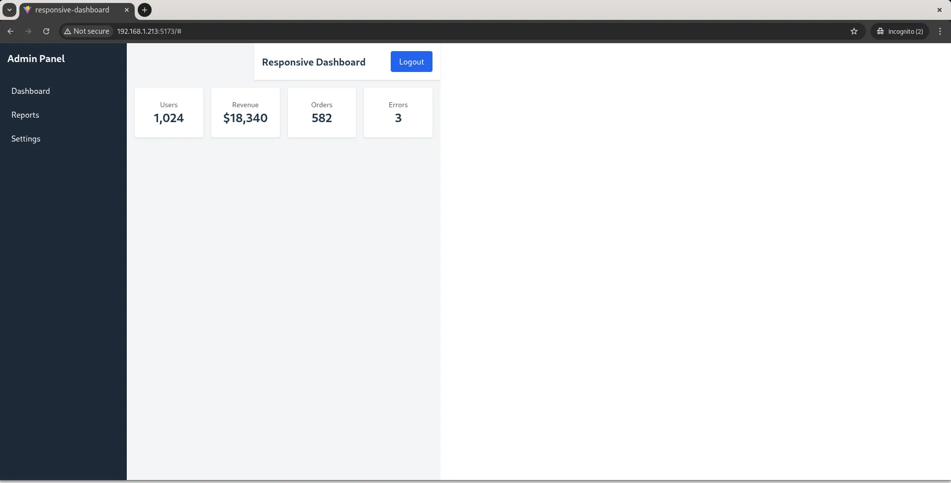
Photo by admingeek from Infotechys
npm install chart.js react-chartjs-2
					added 3 packages, and audited 252 packages in 3s

60 packages are looking for funding
  run `npm fund` for details

found 0 vulnerabilities
🖥️ Line Chart Component |
					// src/components/LineChart.jsx
import { Line } from 'react-chartjs-2';
import { Chart as ChartJS, CategoryScale, LinearScale, PointElement, LineElement } from 'chart.js';

ChartJS.register(CategoryScale, LinearScale, PointElement, LineElement);

const data = {
  labels: ['Q1', 'Q2', 'Q3', 'Q4'],
  datasets: [{
    label: 'Traffic',
    data: [300, 500, 400, 650],
    borderColor: '#3b82f6',
    fill: false
  }]
};

const LineChart = () => <Line data={data} />;

export default LineChart;
Tailwind’s utility-first classes enable full responsive control.
| Class | Description |
|---|---|
sm: | Small screens (≥640px) |
md: | Medium screens (≥768px) |
lg: | Large screens (≥1024px) |
xl: | Extra-large (≥1280px) |
Use responsive prefixes to adapt UI for mobile, tablet, and desktop layouts.
🔄 Option 1: Serve with Nginx |
npm run build
sudo dnf install nginx
sudo cp -r dist/* /usr/share/nginx/html/
sudo systemctl enable --now nginx
🔄 Option 2: Use Docker (DockerFile) |
					FROM node:20-alpine
WORKDIR /app
COPY . .
RUN npm install && npm run build
RUN npm install -g serve
CMD ["serve", "-s", "dist", "-l", "3000"]
Build and run:
docker build -t dashboard-app .
docker run -d -p 3000:3000 dashboard-app
Running a responsive dashboard built with React and Tailwind CSS on RHEL 9 or CentOS Stream 9 is entirely possible with minimal configuration. Thanks to Vite, Tailwind’s utility-first approach, and React’s component architecture, building modern UIs in enterprise environments is easier than ever.
This setup works great for:
|
|
|
|
Did you find this article helpful? Your feedback is invaluable to us! Feel free to share this post with those who may benefit, and let us know your thoughts in the comments section below.
In this article, we will review the installation process for Eclipse IDE on CentOS8. The same procedure can apply to RHEL8 as they are similar operating

Install Visual Studio Code on RHEL 10 Workstation in minutes. Follow this clear, step‑by‑step guide with CLI snippets, tables, repo setup, troubleshooting tips, and extension

Learn how to install and configure IntelliJ IDEA on RHEL 9 | CentOS 9. Follow this step-by-step guide with CLI examples, optimization tips, and performance