
In this article, we will guide you on how to install R and RStudio on RHEL9 or CentOS9. As well as, provide you with best
In this article, we will review how to install ggplot2 in R and go over some usage examples.
R is a programming language that is popularly used for statistical computing and graphics. It has a wide range of tools that can be used to visualize data. One of the most widely used and popular libraries for data visualization is ggplot2. Ggplot2 was developed by Hadley Wickham and it is based on the Grammar of Graphics theory by Leland Wilkinson. The library allows users to create high-quality, aesthetically pleasing plots with minimal coding.
ggplot2 was first released in 2005 and since then it has gained a lot of popularity among the data science community. It was designed to be a more flexible and expressive system for creating graphics compared to other libraries. The library is based on the Grammar of Graphics theory, which is a systematic approach to creating graphics that emphasizes the importance of separating the data from its graphical representation. This makes it easier for users to create complex visualizations and customize them according to their needs.
To install ggplot2, you first need to install R on your system. Once R is installed, you can open the R console and run the following command:
					$ R

R version 4.2.2 (2022-10-31) -- "Innocent and Trusting"
Copyright (C) 2022 The R Foundation for Statistical Computing
Platform: x86_64-redhat-linux-gnu (64-bit)

R is free software and comes with ABSOLUTELY NO WARRANTY.
You are welcome to redistribute it under certain conditions.
Type 'license()' or 'licence()' for distribution details.

  Natural language support but running in an English locale

R is a collaborative project with many contributors.
Type 'contributors()' for more information and
'citation()' on how to cite R or R packages in publications.

Type 'demo()' for some demos, 'help()' for on-line help, or
'help.start()' for an HTML browser interface to help.
Type 'q()' to quit R.

> install.packages("ggplot2")
Select an option based on your locale. For example purposes, we will go with the first option.
					Installing package into ‘/home/admin/R/x86_64-redhat-linux-gnu-library/4.2’
(as ‘lib’ is unspecified)
--- Please select a CRAN mirror for use in this session ---
Secure CRAN mirrors

 1: 0-Cloud [https]
 2: Australia (Canberra) [https]
 3: Australia (Melbourne 1) [https]
 4: Australia (Melbourne 2) [https]
 5: Australia (Perth) [https]
 6: Austria [https]
 7: Belgium (Brussels) [https]
 8: Brazil (PR) [https]
 9: Brazil (RJ) [https]
10: Brazil (SP 1) [https]
11: Brazil (SP 2) [https]
12: Bulgaria [https]
13: Canada (MB) [https]
14: Canada (ON 3) [https]
...output omitted...

74: USA (OR) [https]
75: USA (TN) [https]
76: United Arab Emirates [https]
77: Uruguay [https]
78: (other mirrors)

Selection: 1
Be patient. The installation will take a few minutes to complete.
					...output omitted...
    wrap_dims                               html
    zeroGrob                            html
*** copying figures
** building package indices
** installing vignettes
** testing if installed package can be loaded from temporary location
** testing if installed package can be loaded from final location
** testing if installed package keeps a record of temporary installation path
* DONE (ggplot2)

The downloaded source packages are in
	‘/tmp/RtmpSJtJHz/downloaded_packages’
>
Upon completion, you will be presented with an output similar to what is displayed above. Issue the following command to load it:
> library("ggplot2")
ggplot2 is a powerful library that can be used to create a wide range of visualizations. Here are some examples of the types of visualizations you can create with ggplot2:
Here’s an example of a scatter plot.
					> ggplot(data = mtcars, aes(x = wt, y = mpg)) +
  geom_point()
From the Rstudio IDE, we can see the resulting output (below):
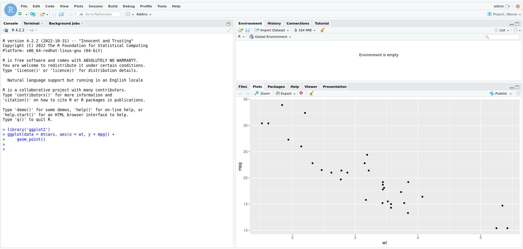
Photo by admingeek from Infotechys
Enter the following command to produce a line plot.
					> ggplot(data = economics, aes(x = date, y = uempmed)) +
  geom_line()
Here’s the resulting output in Rstudio:
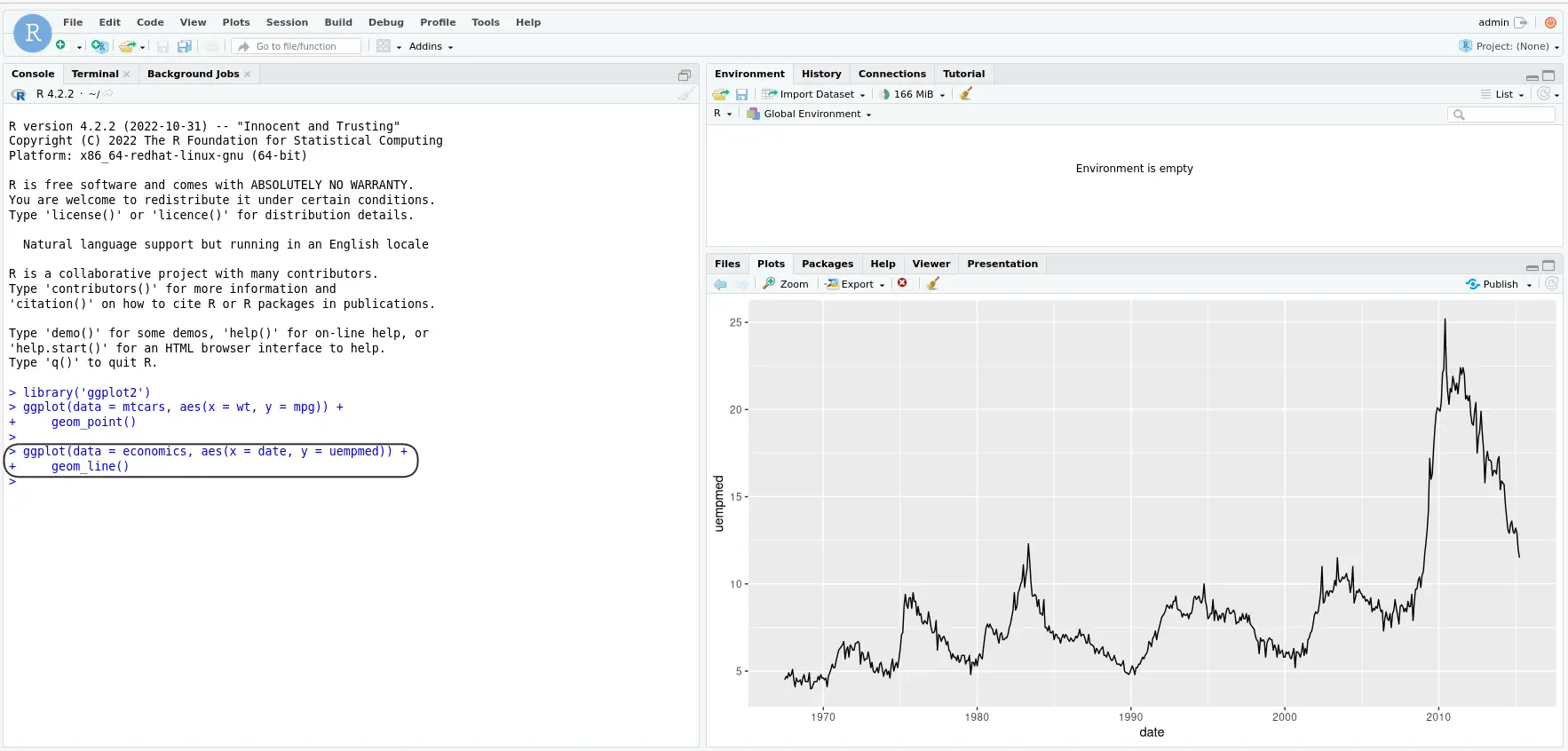
Photo by admingeek from Infotechys
To produce a bar chart, enter the following command:
					> ggplot(data = diamonds, aes(x = cut, fill = clarity)) +
  geom_bar(position = "dodge")
The resulting Rstudio IDE output:
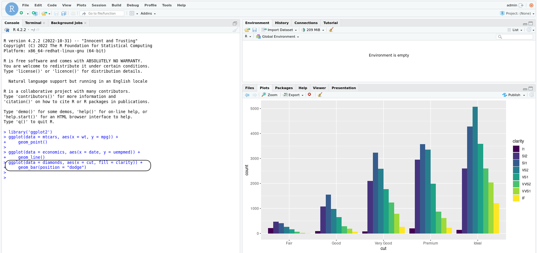
Photo by admingeek from Infotechys
In addition to installing and using ggplot2, there are several best practices that can help ensure that your visualizations are effective and accurate:
Choose the right visualization for your data: Different types of data require different types of visualizations. It is important to choose the right type of visualization that effectively represents the data and communicates the message you want to convey.
Keep it simple: While ggplot2 allows for a lot of customization, it is important to keep the visualization simple and easy to read. Use appropriate labels and titles and avoid cluttering the plot with unnecessary information.
Use appropriate color schemes: The use of color can greatly enhance the visual impact of a plot. However, it is important to use appropriate color schemes that are easy to distinguish and avoid colors that can cause confusion.
Label your axes: Proper labeling of the axes is essential to ensure that the visualization is understandable. Always include axis labels that clearly indicate the units of measurement.
Use appropriate scales: The choice of scale can greatly affect how the data is perceived. It is important to choose the appropriate scale for the data being presented to accurately represent the relationships between the data points.
Proofread: Before sharing your visualization, always proofread it for errors and inconsistencies. Double-check your data, labels, and formatting to ensure that everything is accurate and presented clearly.
By following these best practices, you can create effective and accurate visualizations that clearly communicate your data and insights.
ggplot2 is a powerful data visualization library that can be used to create high-quality, aesthetically pleasing plots with minimal coding. It is based on the Grammar of Graphics theory, which makes it easier for users to create complex visualizations and customize them according to their needs. To install ggplot2, you first need to install R on your system and then run the command to install the library. With ggplot2, you can create a wide range of visualizations such as scatter plots, line plots, and bar charts, among others.
Related Posts

In this article, we will guide you on how to install R and RStudio on RHEL9 or CentOS9. As well as, provide you with best

In this article, we will guide you through the process of installing EPEL on various versions of RHEL and CentOS. Table of Contents 🔈Introduction The

In this article, we will review the installation process for Eclipse IDE on CentOS8. The same procedure can apply to RHEL8 as they are similar operating
