
Commands
In this article, we will review the installation process for Eclipse IDE on CentOS8. The same procedure can apply to RHEL8 as they are similar operating


In this article, we will review the installation process for Eclipse IDE on CentOS8. The same procedure can apply to RHEL8 as they are similar operating

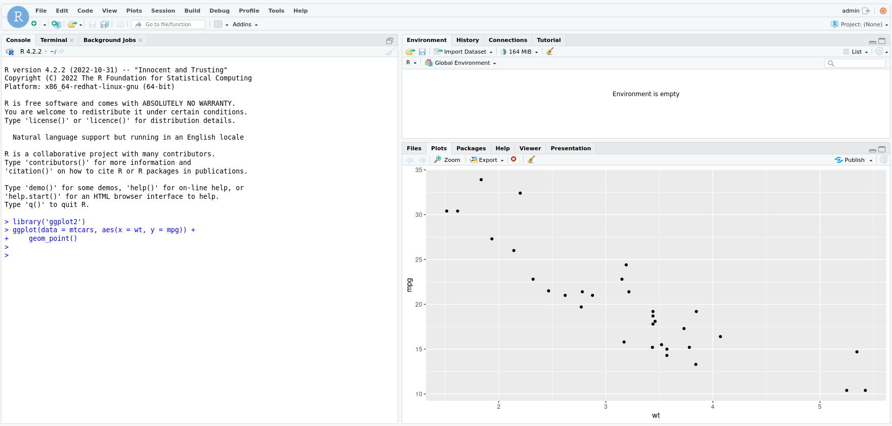
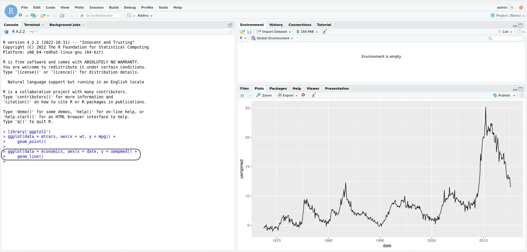
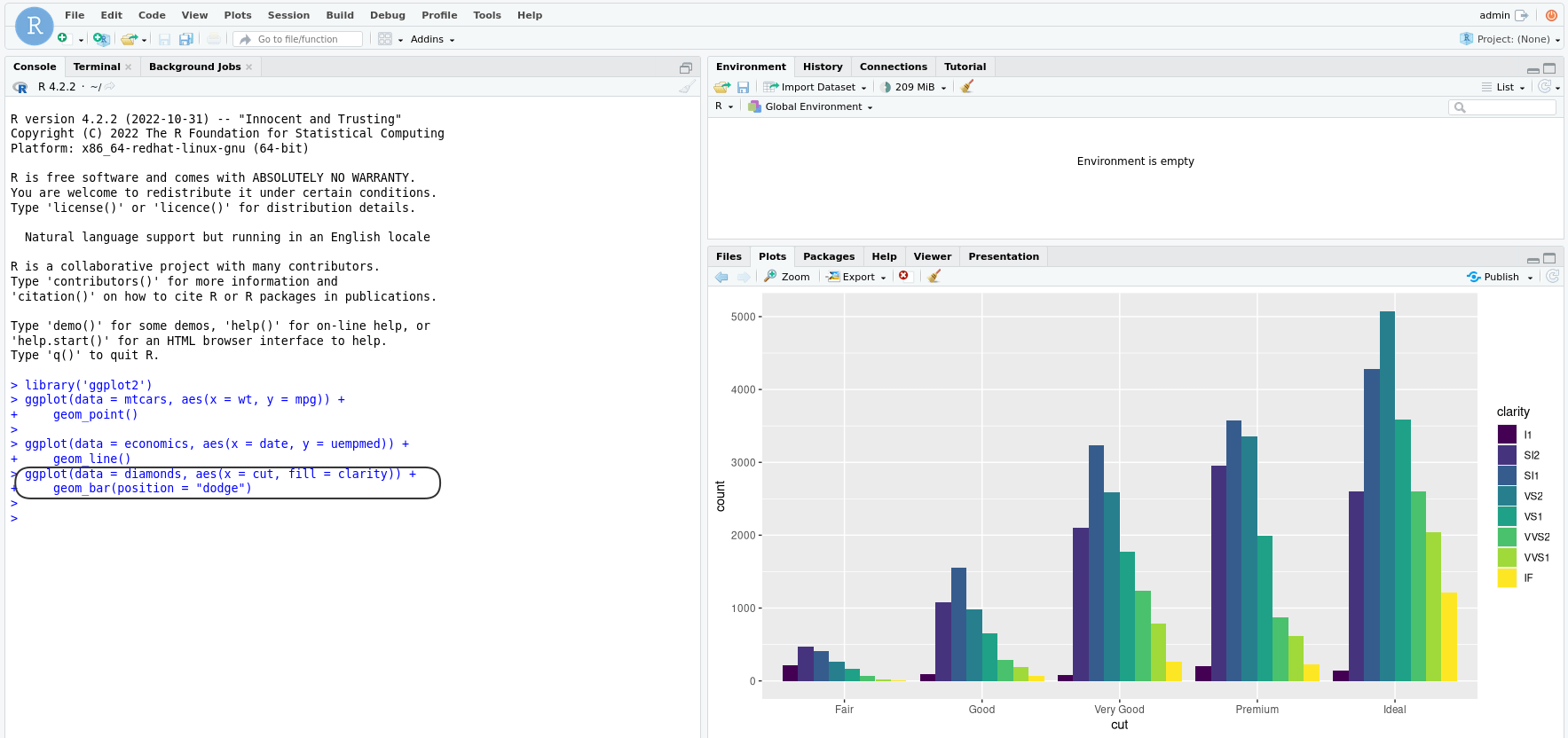
In this article, we will guide you on how to install R and RStudio on RHEL9 or CentOS9. As well as, provide you with best
In this article, we will guide you through the process of installing EPEL on various versions of RHEL and CentOS. Table of Contents 🔈Introduction The